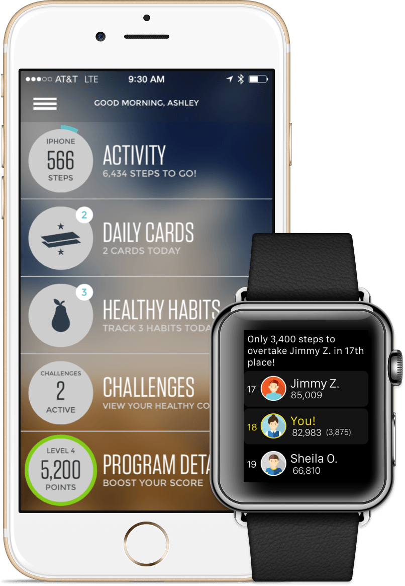

In late 2015 Virgin Pulse, one of the Virgin brand companies, approached us to help design and build an Apple Watch app to complement their existing health and fitness platform. Like most companies considering the Watch they had lots of questions. Why do we need a Watch app? What features should it have? How can we make it simple and useful? We helped Virgin find the answers.
We collaborated closely with the Pulse product team and Apple to design and build a Watch app that let users track their health habits simply and quickly. We made the app useful by ruthlessly cutting features that were not a great experience on the Watch. We prioritized and focused on features that were not just good on the Watch, but better there. In the end we created an award winning Watch app
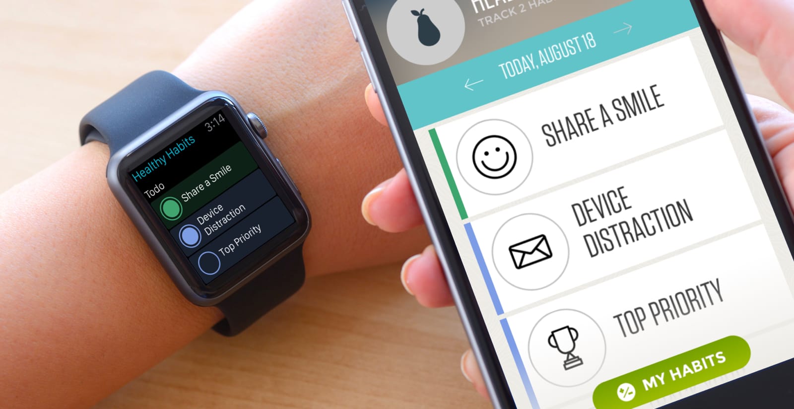
The best software is simple and efficient. When creating a Watch app for the Virgin Pulse platform we drastically reduced the feature set so that only the essential remained. Here are some of the ways we did it:
• We reduced all Watch interactions to a single tap so that users could track their healthy habits in the fastest way possible. This increased overall use (and thus value) of the service.
• We removed dozens of screens from the Virgin Pulse iPhone and web app experiences that were inappropriate for the Watch’s small screen size. Screens for viewing long lists, managing content, or configuring settings ended up much more appropriate for larger screen sizes.
• We ended up with a three-screen app…really! By focusing on a minimal set of actions and taking advantage of Apple’s built-in screens we ended up with an experience that looks and feels simple and lightweight.
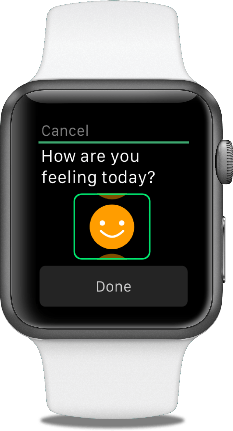
Designing for the Watch is not easy. A tiny screen, on a faraway wrist, that needs to communicate with an iPhone to work. A major challenge of this project was about overcoming these design and engineering constraints. We minimized communication between the Watch and the iPhone at every chance to keep the app as fast as possible. Speed is a feature! We did this in several ways:
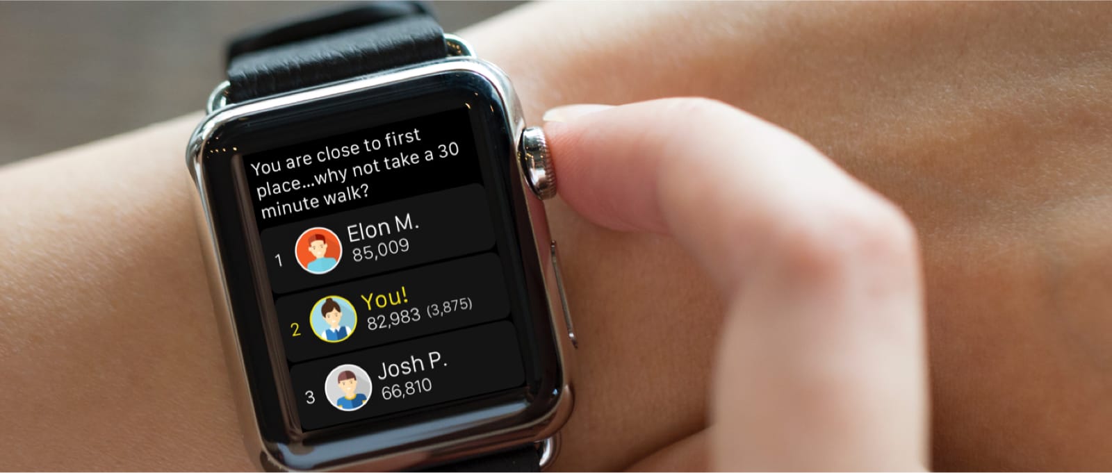
• We lazy-loaded avatars on the leaderboard screen so users could start reading text instantly while graphics loaded more slowly in the background.
• We redesigned screens to assume success, refreshing instantly for users while the app sent updates to the phone in the background.
• We implemented Apple’s handoff technology to allow users to jump over to their iPhone when they did want to dig deeper into a specific part of the app.
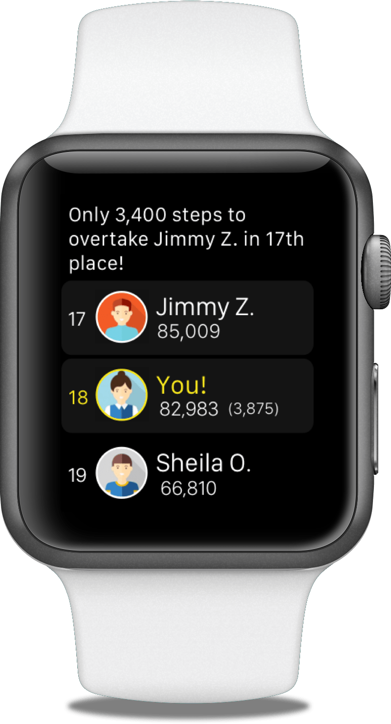
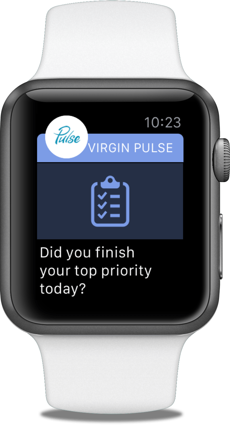
It was clear from talking with folks at Apple that they see the Watch as a notifications platform for what’s most important during the day. We supported this idea in several ways:
• We created a timing system so notifications were contextual. For example, we prompted users about how they slept soon after they wake up. This minimized distraction.
• We made most notifications a simple choice so users could immediately respond without opening the full app. We optimized each notification to be as simple as possible, knowing that people will be using the app while walking or running.
• We color coded notifications to the same palette used on the iPhone and web app so that there is continuity across all three platforms.
