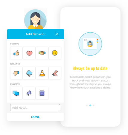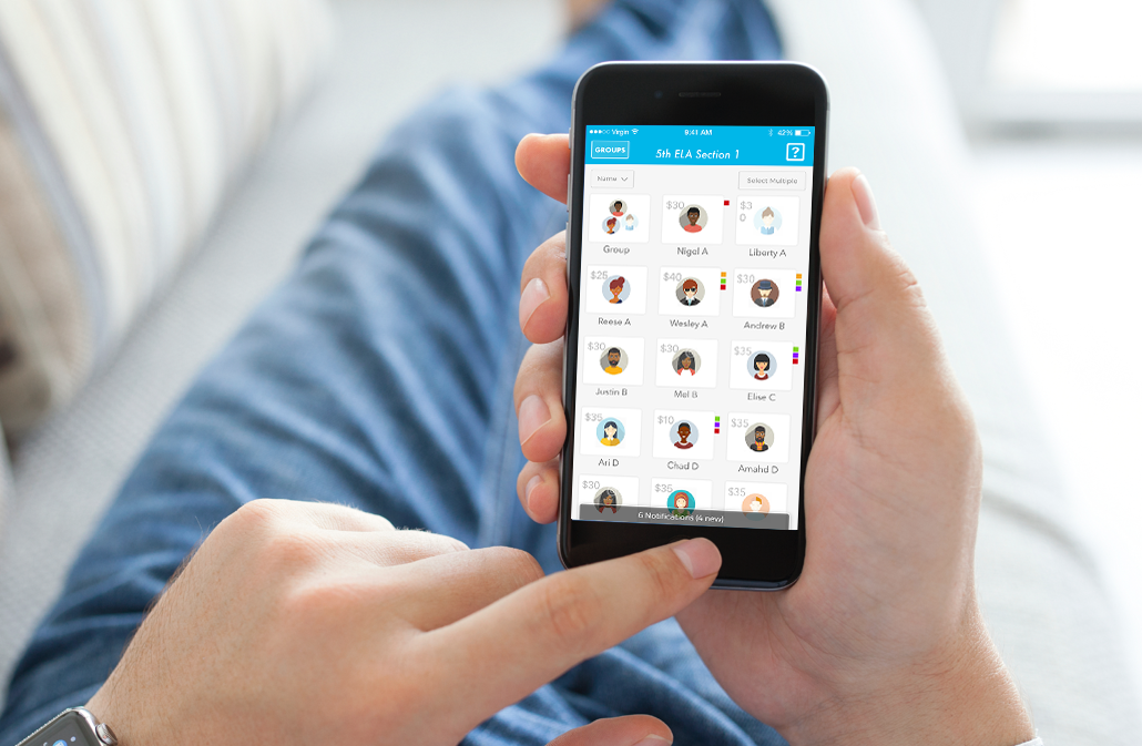


Kickboard is an education-tech company working on software to create safe and happy schools. Their product team faced a problem we see a lot: in the process of digital transformation how do you figure out what to build on mobile? Teachers told them the desktop app wasn't lightweight enough on mobile devices but rebuilding the entire feature set there didn't make sense. They also knew engagement was spotty: some teachers used their platform and some didn't. So we jumped in with a design sprint to figure out what functionality a mobile app should have to best support teachers.

The Kickboard platform began as a Web application built for teachers and administrators to document and track student activity. Each day teachers record what students are doing and over time build up data showing their progress. Is Sally’s behavior improving? Does Ms. Brown’s science class have more issues than Ms. White’s? Behaviorally speaking, how does the third grade compare to the second grade? In our design sprint interviews we discovered that teachers were inputting these student behaviors at all hours of the day, during breaks, and even at night. This wasn’t ideal. Some teachers were so overwhelmed that they gave up and stopped using the software.


We then had our eureka moment: every teacher could use their mobile device to record behavior in real time and then augment that data later. If we focused on an app that easily enabled logging of student behavior—the moment it happens—then more data would be captured, reports would be more accurate, and teachers would get more value from the platform. Our hypothesis played out: it was enough to simply record what happened in the moment: teachers would remember any details later. The resulting mobile app was super simple, a small subset of what the desktop app did.
The mobile app increased engagement as we were hoping. Based on that success Jen Medbery, the Kickboard CEO, wanted to refresh the web application. Like many web applications the Kickboard platform had grown organically and felt like a mishmash of features cobbled together. To create a modular platform to which things can easily be added going forward, we chose React/Redux as our technology and tied into the APIs we created during the mobile build. This proved to be a fantastic choice—giving us the speed we needed to rapidly test sophisticated dashboard designs.

In the end we helped solve several common challenges product teams face today. Teachers are tracking more behaviors with a simple mobile app and administrators have better insight into school health with the well-tested desktop app. As a result students are getting a better educational experience and, as far as we're concerned, that's the real payoff.