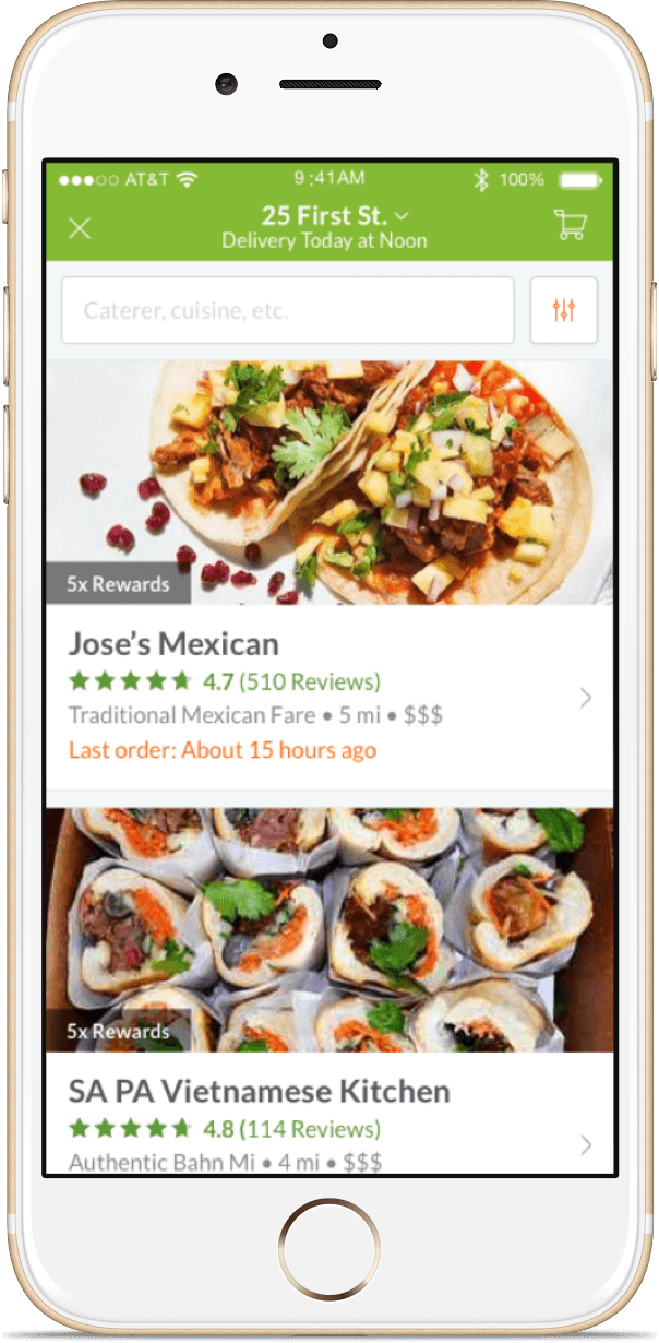

In the summer of 2016 ezCater came to us to help design and build their flagship iOS app. They had a remarkably full-featured but relatively slow mobile web app as their existing mobile experience. They wanted to level up and give their customers a smooth, beautiful mobile experience that put them at the forefront of the catering industry.
Rocket helped ezCater design a sophisticated mobile app that earned rave reviews from existing customers.
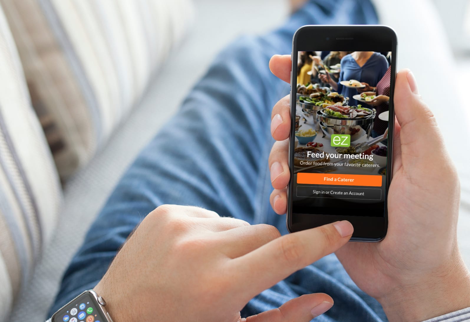
The Shaker furniture makers have a saying: “(once) it is both necessary and useful, don’t hesitate to make is beautiful.” We follow this in our design work too…focusing on making software useful first. Then, and only then, do we make it beautiful. The ezCater app is both of these and the experience feels just right as a result.
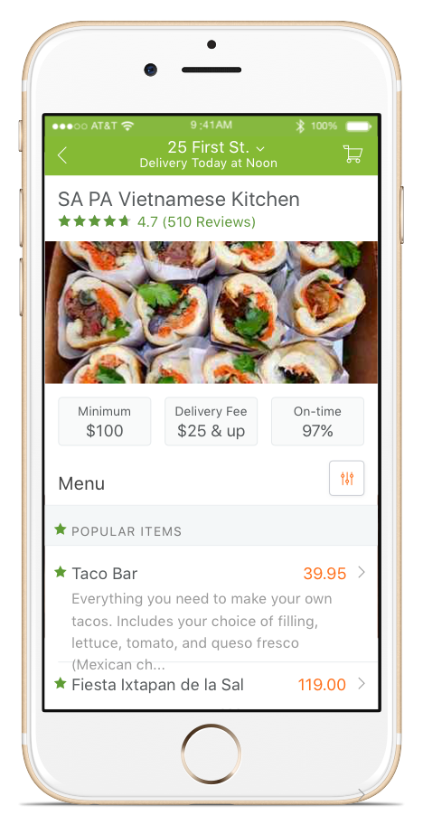
When developing the ezCater iOS as a native app we took advantage of native capabilities like Core Data and mapping tools to create a seamless experience. The speed with which a native app can access these tools improves the user experience across the board…resulting in an app that lets users do quick work and be on their way.
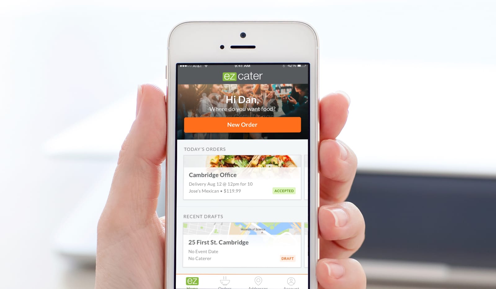
The user experience of mobile needs to be fast and efficient. You need to let users get in, do their work, and be done as quickly as possible. To achieve this we refined the home screen to ensure that it did only what it needed to: support the primary use cases of people who need catering. The home screen ended up showing only two things: a list of imminent orders to track and a button to create new orders. For people on the go this was exactly what they needed and the early App Store reviews are demonstrating that users are indeed happy with the new app.